Sunday, 30 January 2011

EVALUATION...

Evaluation on music magazine...
View more presentations from MoniDeol.

In order to clearly access my evaluation presentation, click on the link;"MoniDeol" and click on the first presentation to view on a larger scale.

Thursday, 9 December 2010

PRELIMINARY EXCERISE/PLANNING...

Preliminary excerise


Flat plan
These two images show the flat plans for my magazine. As you can see I plotted out where I would put all the features, images and advertisements in the magazine. The Publisher of my magazine would be; "Bauer Media Group". Through out the magazine I have showed that there was been a lot of advertisement features, I chose to do this because the greater the amount of advertisements you have in you magazine will help to contribute to the cost of the magazine as advertisements fund towards magazine creation. With this is mind I had made the decision that my magazine would cost £1.99, this would  attract my target audience because its affordable to purchase on a monthly basis, and mainly their parents wouldn't look too pricey.

Tuesday, 7 December 2010

PLANNING...

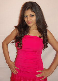
Front cover image


I have chosen this image to use as my front cover of my magazine. I chose this for a number of reasons which include; firstly, she is looking directing at the camera, this creates a strong sense of eye contact with the audience and will definitely contribute to the appeal of the magazine.  From my analysis of a current music magazine on the market now it came clear to me that having eye contact with the camera is a key factor, that must be met when choosing an image for my cover because with direct eye contact the reader engages with the person in the image and gets lured in.
Secondly, it is a medium body shot, which reinforces the conventions of typical front cover images on music magazines. Thirdly, the picture is of an attractive, feminine upcoming new Pop artist. She is wearing a pink dress and she has old brown curly hair. She reinforces the stereotypical image of females and represents young teenage girls and thus will attract girls because she is relatable. 

From the image I had chosen I had to make a few changes in order to make the picture stand out more and be effective and efficient enough to grab people’s attention. This was done by using Adobe software "Photoshop" to brighten the background to white, to make the artist in the image be the focal point of the picture and make her stand out more. Moreover, I had to take away the shadows and air brushed her body to give her a health even glow. 

Wednesday, 1 December 2010

RESEARCH...

Masthead


Through my research of other music magazines I noticed that all the magazine mast head’s and title's where very catchy and simple. For example; "shout","kerrang" and "NME".   Most of the names of the magazines were reflective of the genre of music, for example; "kerrang" cleverly used onomatopoeia to create a title of a magazine which symbolised the sound of hard rock in a simple iconic phrase.
For my magazine I experimented with a range of different words and phrases to use as the mast head for my magazine, which were representative of the genre of music focused in the magazine. For example these are a few of the phrases I can up with; “Spice”, “Beep”, “Pop rhythm” and “Bubblegum.” I wanted to come up with a unique title which would help to draw people’s attention.  I also had to keep in mind that my target audience where primarily young teenage girls, therefore I wanted to create something that was understandable and relatable to them.  Finally I came up with; “Popolicious”.  This stood out to me, the most for a number of reasons. Firstly, it addressed the genre of music clearly Popolicious” which would allow it to easily attract the target audience by clearly staging the genre of music it focused on. Secondly, I asked a number of different people if the name was catchy and appealing to them and I gathered a good, positive response. Finally, I believe that the “Popolicious” sums up my magazine effectively; it’s fun, girly and engaging.  
Development of Maskhead...

Once again I went through a range of different fonts and desgins of the Mask head, before I decided on one which was most suitable for my magazine. I wanted to have soft, round font which was inviting to approach but still eye catching.
I decided that my colour scheme would consist of only 4 main colours. These are; pink, yellow, black and white. I wanted to keep the colour scheme simple because if I had too many different colours on the cover it would make it look messy, unprofessional and there would be too much going on. The colours chose all feminine colours that are eye catching and targets teenage girls.
 Popolicious

POPOLICIOUS
Popolicious